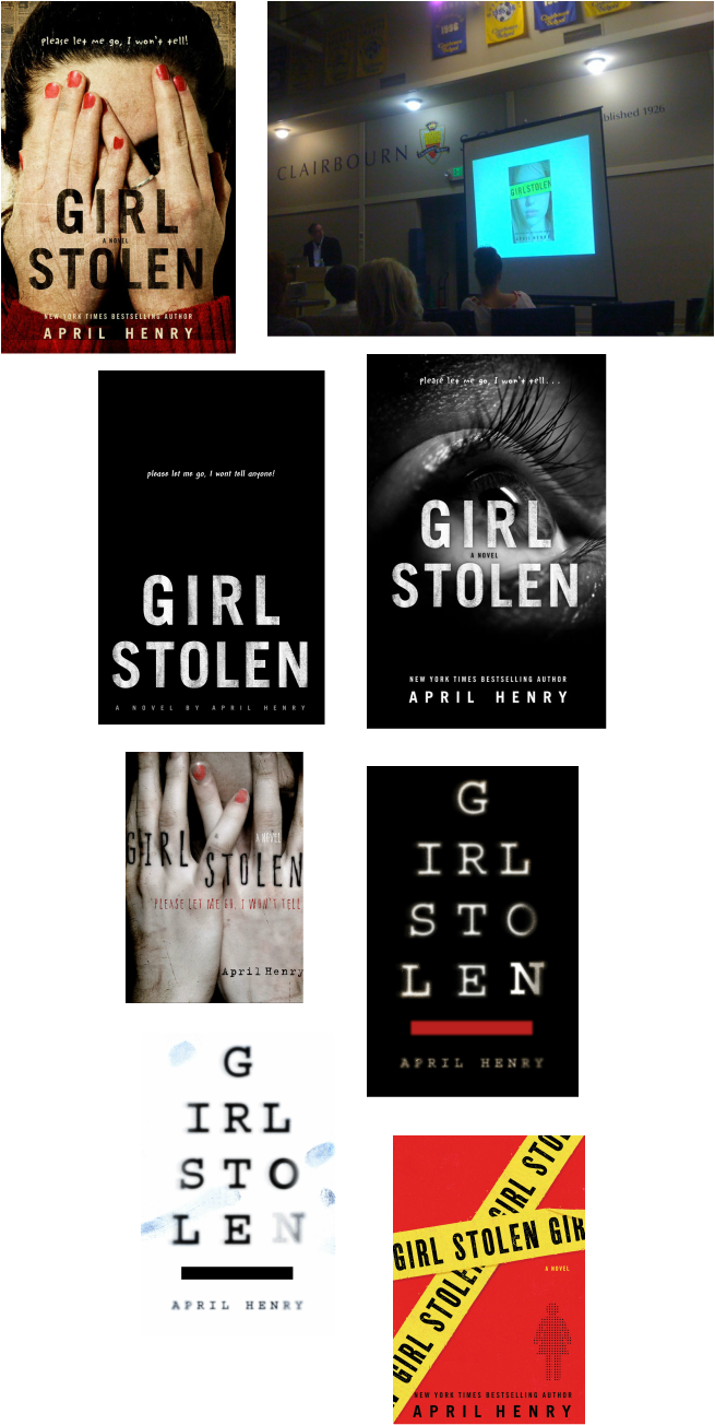
Just some of the fun covers Designer Rich Deas considered
How a Cover is Born
When I saw the cover for the hardcover for Girl, Stolen, I fell in love. The designer, Rich Deas, told me he made more than 30 comps before the final cover was chosen. A few of them are shown here. (The paperback design came later.)
Rich told me that, while he is often provided with a synopsis and notes, he prefers to read the material. He said, “I don’t really feel comfortable designing any cover without reading the text. As an art director, it’s especially difficult to direct another designer’s work without fully knowing the material. So I try my best to read as many manuscripts as possible.”
As he is reading the manuscripts, he scribbles notes, flags pages, and draws sketches. He said, “ It’s more a free stream of thought which I come back to later and edit down.”
What about stock photography?
As a reader and author who also loves book covers, I’ve noticed that stock photography is more and more common. Rich told me that approach has its own pros and cons. “It can be a great resource, giving designers access to millions of great images that we would not be able to obtain from an affordable photoshoot or illustration. But creatively, it can be limiting when a designer depends too much on stock photography for a “quick fix” or presentable option. The best covers are usually based on strong concepts and original ideas, not just a pretty picture.”
Rather than relying on a single stock photo, Rich says designers are now using and manipulating a combination of photos to create a unique image that is a good fit for the book.
The real girl behind the scenes
So where did the image for Girl, Stolen come from? It’s actually of Rich’s neighbor, a teenage girl.
He says, “When possible, I like to create images with my own photos and illustrations. It feels more natural than looking through a million images trying to find something that almost suits what I am looking for.” He ads, "“I took probably a couple hundred photos before we decided on this version. In Photoshop, I added the distressed texture and title lettering, and tweaked the color. The fingernail polish was a last minute addition - and then it was later scuffed up.”
As for my cover, he told me, “The cover image for Girl Stolen is a direct response to reading the manuscript. The book is incredibly intense! The perspective of a blind girl caught in a desperate situation is a brilliant way to pull the reader in. I wanted the cover to be a bit unnerving. I would not have come up with this image or concept without reading the story first.”
The next step for Rich is to comp up at least three different concepts. These are shown to the publisher and editor. If everyone agrees on one or two, these designs are then shown to the head of sales and marketing and the president of the division.
